Case study · Experience strategy

The deliverable was a website. The work was deciding what a stranger needs to understand first.

Structuring understanding, then building something that carried it.

A brand strategist needed a site. The site was never the interesting problem. The interesting problem was that the normal way of introducing someone tells you they are qualified long before it tells you whether you’d want to work with them — and no amount of visual design fixes an order that is wrong.

OutputA website
The actual workDeciding what has to be understood, and in what order
Beat 01 · The noticing

A person kept being introduced by what she does instead of what she’s for.

Not by a previous website — there wasn’t one. By the convention. Ask how a strategist is normally introduced and you get a title, a client list, and a set of credentials, with the reader left to assemble a person out of information.

Credentials answer is this person qualified. But that is not the question a visitor is actually holding. They are deciding whether they want to work with someone, and that decision does not run on qualifications.

The convention — the thing being argued with

Title, then work as proof of the title, then a paragraph about the person, then contact. Credibility first, on the assumption that credibility is what convinces.

The position taken

Credibility answers a question nobody has asked yet. Someone has to care first. So the order was built around how a stranger actually comes to trust a person.

Beat 02 · The map

Sequence the site around a decision, not a content inventory.

Every section was assigned a single job, and the order was set by what a visitor needs to understand before the next thing can land: question → evidence → belief → process → person → contact.

Belief before biography. Learn the person first and the work reads as a résumé — a list of things that happened. Learn the question first and the person becomes the answer to it. Same sections either way; the order decides which one someone leaves with.

Beat 03 · The decisions

Five decisions, all still visible on the live site.

Each one could have gone the ordinary way. None of them are styling — they are choices about what a visitor is allowed to understand, and in what order.
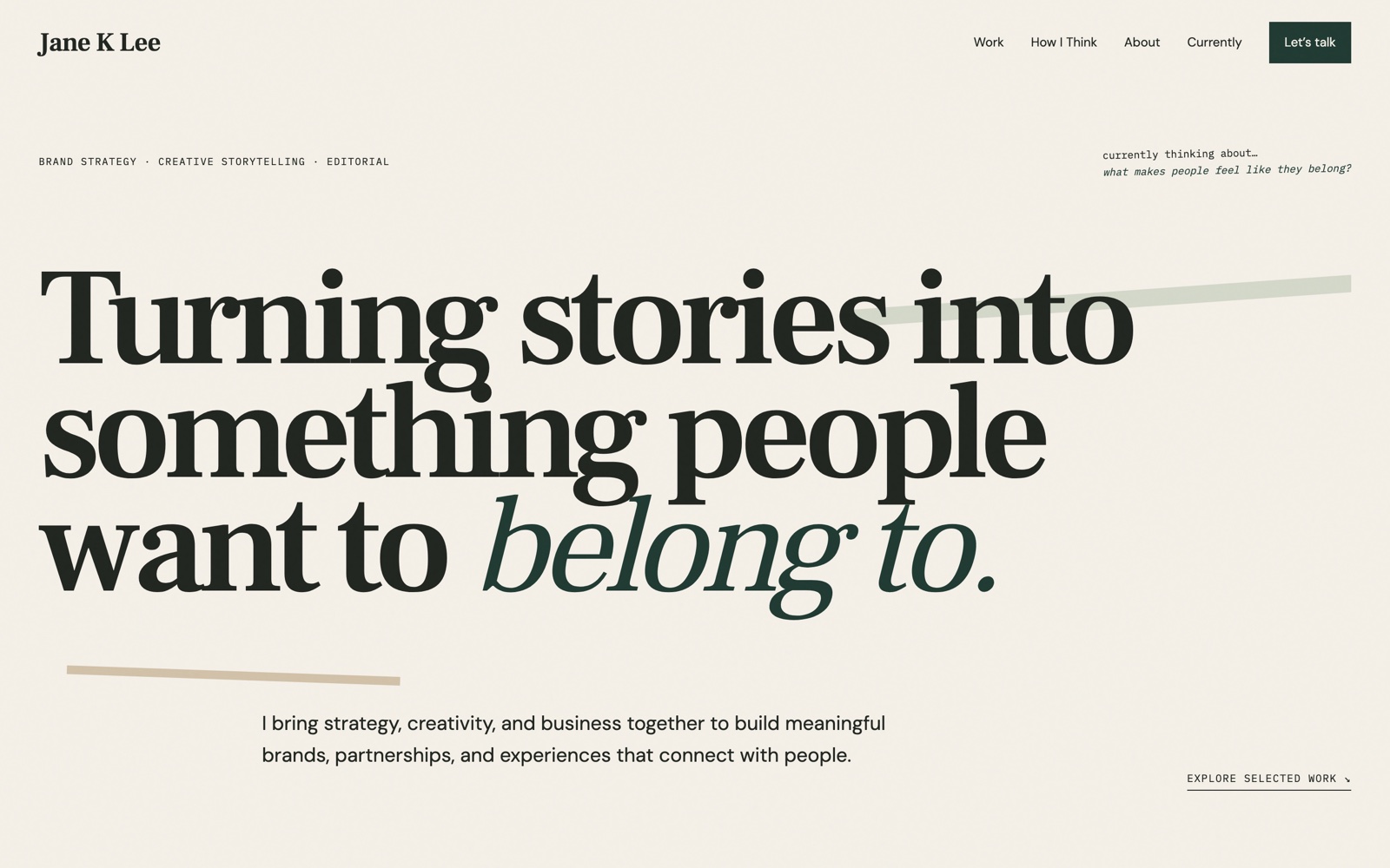
janeklee.com opening screen: the name and a small descriptor line in the header, above a large serif statement reading Turning stories into something people want to belong to.
The opening screen · captured from the live site, 18 Aug 2026
01

The header identifies. The narrative introduces.

The descriptor exists — it just isn’t responsible for creating understanding. It sits small and functional beside her name, doing a header’s job, while the first thing said at full size is what she’s for.

On the siteTurning stories into something people want to belong to.

02

The work section claims a pattern instead of listing projects.

Six projects across entertainment, publishing and events could easily read as a varied client list. Named as a pattern instead, they become evidence for one recurring instinct — which is the actual thing being sold.

On the siteI’ve noticed I tend to chase the same kinds of questions, even when the projects look completely different.

03

The idea leads. The client is metadata.

Recognisable names are present, but underneath. Each project is introduced by what it was trying to do, so the work argues for the question rather than borrowing status from a logo.

On the siteMaking adaptations feel like something fans could be part of.

04

Don’t make someone leave the story to experience the story.

Her process content lived as links out to Instagram. Functionally that worked; experientially it ended the visit — one click and the visitor was inside an infinite feed, in someone else’s environment, with no reason to come back. So the content was rebuilt to feel native to where it came from while staying inside her site. The decision was about custody of attention, not about embedding.

The ruleThe story shouldn’t be somewhere else.

05

No résumé anywhere — and the close returns to the open.

No dates, no employers, no job history on any part of the page. Nothing to skim, nothing to filter by. And the last line answers the first: the site opens on belonging and ends on it, so it reads as one argument rather than a set of pages.

Opens…something people want to belong to.ClosesLet’s build something people want to be part of.

It stopped being a résumé and became an introduction.

Jane is my wife. This was personal; the discipline was real. She was the stakeholder and the subject, and the job was never to invent a persona — it was to make what was already there legible. The only real pushback through the build was hers, and it was the right one: keep making sure this feels like her and not like a professional template.

The reason this sits beside the enterprise work rather than in a separate design folder is that it is the same move, performed on a person instead of a process. Called experience strategy here, systems work there. The scale changes the name and almost nothing else.

EnterpriseSystems · find what the system is optimizing for → decide it’s wrong → redesign around who is responsible.
Barry OSProducts · find what the product is optimizing for → decide it’s wrong → redesign around what an owner needs to know next.
janeklee.comExperiences · find what the experience is optimizing for → decide it’s wrong → redesign around how a stranger comes to understand a person.
How it was built

AI didn’t shorten the thinking. It shortened the distance between a decision and something you could react to.

Me Problem, experience, direction
  • Identified the problem
  • Shaped the experience strategy
  • Made the UX decisions
  • Directed the visual system
  • Tested each iteration
  • Gave the feedback that changed it
Jane Subject, voice, authenticity
  • Stakeholder
  • Subject matter expert
  • Owner of her brand voice
  • Final approval on whether it sounded like her
AI Implementation partner
  • Closed the gap between deciding and seeing
  • Turned decisions into working experiences
  • Made ideas testable quickly enough to be worth testing

Find the friction. Design the thing that removes it. Use whatever makes it real.

Concept → prototype → test → refine used to run at the speed of a build cycle, which meant most experience decisions were argued about rather than tried. The distance between deciding something and seeing it is now short enough that trying is cheaper than arguing. What the loop asks for is someone who knows which decisions matter and can tell when one of them is wrong.

Which is the same thing the enterprise work asked for, and the same thing Barry asked for. The tools changed how fast a decision becomes something you can react to. They did not change who has to make it.

Experience strategy · Narrative architecture · Brand strategy · UX · Visual system · Implementation collaboration

Every decision above is verifiable at janeklee.com · structure and copy recorded 18 Aug 2026 · no prior public site existed, so nothing here is framed as a redesign · no metrics claimed

ArtifactNarrative architecture

Experience strategy · Narrative architecture

The pages were the deliverable. The order was the work.

Seven sections is what got built. Which one a visitor meets first, and why each one earns the right to the next, is what was actually decided. Every section below exists because of the section before it — the order is the argument, and the argument is the thing that had to be designed.

What was deliveredSeven sections on one page
What was decidedThe sequence a stranger has to travel to understand a person

What makes people feel like they belong?

This is Jane’s actual question, and on the live site it is set small in the top corner under currently thinking about… — it is not the headline. That placement is the decision. The header identifies her (name, navigation, disciplines), which frees the opening line to introduce her instead of describing her. Identification and introduction are two different jobs; making one element do both is what turns a site into a résumé.

Live at janeklee.com · a corner note, not the hero · her words, not invented for the site
SectionThe job it doesWhat the visitor now knows
IdentificationHeader & descriptor

Name, navigation, and the discipline line — handled once, small, where people already look for it. It answers “who is this” so nothing below has to spend a sentence on it.

Who she is.

IntroductionOpening statement

A statement of what she does to something, not a description of herself — and it lands on the same word the corner note is asking about. Possible only because the header already identified her.

What she cares about.

EvidenceSelected work

Six projects, each one standing as an answer to that question rather than a portfolio entry.

That she has actually done it, more than once.

How she thinksThree beliefs

Her reasoning, in her own words — placed after the proof, so it reads as earned rather than asserted.

How she would approach something that doesn’t exist yet.

ProcessBehind the scenes

The making, not the polish. The one section that shows work in an unfinished state.

That the work is made by a person, not produced.

The personAbout · Currently

Biography and current interests — deliberately last, once everything above has already been understood.

Who has been speaking this whole time.

ContactLet’s talk

One way to start a conversation, at the point where someone finally has a reason to.

Whether this is someone to work with.

Belief before biography.

The conventional personal site opens with who someone is and closes with what they think. This one inverts that, and the inversion is the only structural decision that mattered.

Learn the person first and the work becomes a résumé — a list of things that happened. Learn the question first and the person becomes the answer to it. Same sections either way; the order decides which one a visitor walks away with.

The default — not used
  1. About
  2. Work
  3. Contact
The order chosen
  1. Introduction
  2. Evidence
  3. Belief
  4. Process
  5. Person
  6. Contact

Experience strategy · Narrative architecture · Brand strategy · UX · Visual system · Editorial storytelling · Implementation collaboration

Jane is my wife. This was personal; the discipline was real. She was the stakeholder and the subject — the job was to make what was already there legible, not to invent a persona. Structure verifiable at janeklee.com, recorded 17 Aug 2026.

ArtifactCustody of attention

janeklee.com · decision 04 · experience design

The visitor didn’t leave because it was broken. They left because it worked.

Her process content lived on Instagram, and the site linked to it. Every link worked exactly as intended. That was the problem — each one ended the visit and handed the visitor to an infinite feed.

Before · the journey as inherited

The story stopped mid-sentence, and the visitor kept going somewhere else.

Reading her work, a visitor reaches the section showing how something was actually made. The content is one tap away — on another platform, in another environment, surrounded by everything else that platform wants them to watch next.

Jane’s site
01Arrives on her story
02Reaches the process content
03 · exitTaps to watch it

Journey ends here. Nothing was designed to bring them back, because nothing could be.

Somewhere else
04Lands in another app
05The next thing autoplays

…and the feed does not end

Optimized for showing the content · the link succeeded and the visit did not

After · the journey redesigned

The content came to the visitor instead of the other way round.

Same content, same feel — it still reads as the thing it is, from where it came from. What changed is that watching it is now part of her story rather than an exit from it. The visitor never has to choose between seeing the work and staying in the narrative.

Jane’s site
01Arrives on her story
02Reaches the process content
03Watches it in place, in context
04Continues to the next section
05Reaches the one thing she asks for
Somewhere else

No exit in the path. Nothing to return from.

Optimized for keeping the thread · the visitor finishes the story they started

The treatment · what the visitor actually sees

Before, it takes two screens. After, it takes one.

The journey map says where the visitor goes. This says what surrounds them when they get there — whose layout, whose typography, whose next thing. Prose is shown as rules because the point is the frame around the content, not the words inside it.

Before · the link
Jane’s page

Her story, mid-thought

Watch on Instagram ↗

The only way to see the work

Leaves
Hands off
Another platform

Someone else’s account bar, search, navigation

Her content, as one item in someone else’s system

Suggested next · already scrolling

Lost · her layout · her typography · the sentence she was in the middle of · whatever came next

After · in place
Jane’s page

Her story, mid-thought

The same content · kept vertical · kept short · still reads as what it is

Her caption, in her voice

And the story continues

Kept · her layout · her typography · the thread · the next thing she wants them to read

The content keeps the shape it was made in · what changes is whose page it is playing on

The question was never how to show a video.

It was who should have to move — the visitor, or the content. Framed that way the answer is obvious, and it stops being a question about embedding at all.

Which makes it the same move as the enterprise work, at a much smaller scale — and the same move as Barry. It is the only move any of them make.

BeforeThe visitor travels to the content, and does not come back.
AfterThe content travels to the visitor, and the story continues.
The same operating pattern · three scales
EnterpriseSystems

Was optimized forcompleting a request, so ownership fell through the seams between teams

Rearranged aroundwho is responsible at each handoff

BarryProducts

Was optimized forstoring information, so the work of deciding stayed with the person

Rearranged aroundwhat an owner actually needs to know next

JaneExperiences

Was optimized forshowing the content, so the visit ended at the moment it worked

Rearranged aroundkeeping the visitor inside the story

Different scales. One habit.

Find what something is quietly optimizing for. Recognize that the thing it optimizes for is not the thing that matters. Redesign it around how people actually behave.

The scale changes what the work is called — systems, products, experiences — and it changes almost nothing about the method.

Same boundary · two answersBarry meets this same platform edge from the other side, where the content belongs to other people rather than to the person building. Content you own can be brought in; content you don’t, can’t. So the right answer there is a different one. The constraint is identical and the ownership is not — which is the point. The method is a way of asking the question, not a stock answer to apply.

Experience decision · no implementation detail shown · journeys drawn from the designed behaviour, not from analytics — no traffic, retention, or engagement figures are claimed